
AI Packaging Design Prompts: Brief to Mockup
Write better AI packaging design prompts with a constraint-first workflow, six copy-ready examples, controlled revisions, mockup checks, and a print-production handoff.
 Lem Gen Team
Useful AI packaging design prompts do not begin with “make premium packaging.” They begin with the product truth and the physical object: what is being sold, who buys it, which package form is real, what the front panel must communicate first, and which details must remain outside the image model.
The short answer is to write a packaging constraint packet. Define the product, container or carton, brand promise, panel hierarchy, material and finish, requested view, and exclusions in separate blocks. Use the model for concept exploration and presentation mockups. Keep the approved logo, exact copy, barcode, regulatory information, dieline, and print specifications in a professional layout and prepress workflow.
Start at the Lem Gen homepage to compare prompt structures, then open the GPT Image 2 text-to-image Workspace for the first concept matrix. When one direction is mostly right, use the GPT Image 2 image-editing Workspace to change the failed area without discarding the whole composition.
Decide what the image must prove
Packaging work produces several different artifacts. A prompt becomes unstable when it asks one image to be all of them at once.
- A visual direction board proves palette, graphic language, material mood, and shelf personality.
- A front-panel concept proves information order and the dominant visual device.
- A three-quarter mockup proves how the design reads on a physical form.
- A family board proves whether multiple SKUs belong together.
- A dieline artwork file maps approved graphics and copy onto a specific production template.
- A print-ready package adds verified dimensions, bleed, safe areas, color handling, finishing notes, codes, legal copy, and prepress approval.
An image model can be valuable in the first four jobs. It can also produce a rough flat-art direction. It should not be treated as the authority for the final two. A convincing fold line is not proof that a carton will close. A plausible barcode shape is not a scannable code. A polished claim is not approved product copy.
Choose one artifact before writing. “Three-quarter concept mockup of a resealable coffee pouch” is a useful deliverable. “Complete package design, dieline, final label, barcode, and photorealistic campaign scene” is five jobs competing inside one frame.
Gather the facts before choosing a style
Style cannot repair a missing product brief. Write a compact source sheet first:
- Product: what is inside, in plain language?
- Buyer: who should recognize that it is for them?
- Sales context: grocery shelf, boutique counter, marketplace thumbnail, subscription box, or direct mail?
- Structure: pouch, folding carton, bottle and carton, sleeve, tube, tin, label, or another confirmed form?
- Required hierarchy: which three things should a buyer notice in order?
- Family logic: one SKU or a range? Which elements stay fixed and which may vary?
- Production facts: is there an approved vendor dieline, real substrate, finishing option, and required code area?
If structure is still undecided, say so. Ask for “concept exploration across a pouch and folding carton” rather than pretending dimensions are final. If the printer has supplied a dieline, use it as the layout authority later; do not ask the model to redraw it from a screenshot.
Build a seven-block packaging constraint packet
A modular prompt is easier to diagnose than one long paragraph. Use seven blocks:
- Deliverable: direction board, flat front panel, three-quarter mockup, or family board.
- Product truth: product, audience, price signal, occasion, and channel.
- Physical form: package type, proportions, closure, and confirmed structural features.
- Brand promise: one emotional and functional impression, without empty luxury adjectives.
- Information map: logo zone, product name zone, variant cue, benefit or descriptor, and intentional blank areas.
- Material and image language: substrate, finish, photography or illustration behavior, palette, and lighting.
- Constraints: no invented claims, fake certification marks, readable placeholder copy, distorted logo, barcode, or production annotations.
Each block owns a different failure. When the package looks like the wrong container, change physical form. When it feels generic, sharpen product truth and brand promise. When the front panel becomes busy, repair the information map. When the mockup looks like plastic but the product uses uncoated paper, change material and lighting.
Separate the fixed system from the variable idea
Before generating, divide the prompt into two columns.
The fixed system contains the product, package form, logo area, information order, shared palette logic, material, and exclusions. The variable idea contains the hero graphic, crop, background relationship, or SKU accent.
This is especially important for a product family. If every generation changes the pouch shape, logo position, type scale, material, and illustration style, you are not exploring a family. You are restarting the brand six times.
A useful first matrix is three directions by two views:
| Direction | Front-panel view | Three-quarter mockup | | ------------------- | ------------------------------------ | ----------------------------------------------- | | Ingredient-led | Tests recognition and hierarchy | Tests shelf warmth and material | | Graphic-symbol | Tests memorability at thumbnail size | Tests whether the device wraps naturally | | Type-led blank-zone | Tests copy architecture | Tests whether restraint survives physical depth |
Six outputs are enough to expose the real decision. Review them before requesting more.
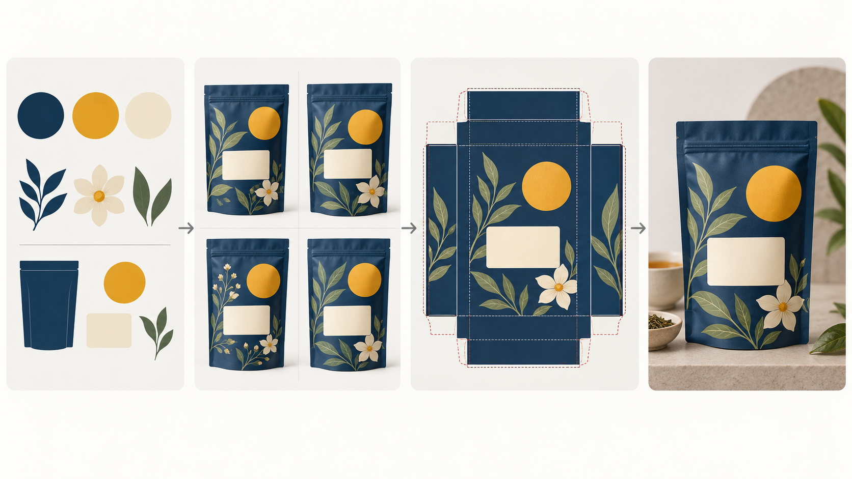
This original illustration shows a concept workflow, not a printable dieline or a benchmark for a particular model. The physical template must come from the approved production process.
Six copy-ready AI packaging design prompts
Replace every bracketed field with facts. These prompts deliberately reserve clean zones for approved copy instead of trusting generated lettering.
1. Specialty coffee pouch family
Deliverable: concept board for a family of three resealable stand-up coffee pouches,
shown as front views and one clean three-quarter shelf mockup.
Product truth: small-batch single-origin coffee for curious home brewers; confident,
knowledgeable, warm, never rustic cliché.
Physical form: matte stand-up pouch with flat base, tear notch, and discreet zipper;
consistent proportions across all three SKUs.
Brand promise: traceable craft made approachable.
Information map: fixed blank logo zone at top, large blank product-name zone in the
middle, origin color cue below, small reserved footer for verified roast facts.
Visual language: bold botanical linework abstracted from each origin, one shared
ink color plus one SKU accent, warm studio light, realistic uncoated matte surface.
Exclude: readable words, invented origin claims, fake certification seals, barcode,
glossy plastic, burlap, coffee-bean explosions, watermark.
The family logic is explicit: structure and hierarchy stay fixed; origin color and botanical cue may change.
2. Clinical skincare bottle and carton
Deliverable: premium but credible packaging concept for one amber serum bottle and
its matching folding carton, front-facing and three-quarter views on a neutral set.
Product truth: fragrance-free barrier serum for sensitive skin, sold online and in
specialist beauty retail; calm efficacy, not medical theatre.
Physical form: small amber glass dropper bottle beside a tall rectangular carton;
believable scale relationship and clean vertical edges.
Brand promise: quiet precision and daily reassurance.
Information map: blank brand zone at top, one strong blank product-name line,
clearly separated blank area for verified ingredient and volume copy.
Material and finish: warm-white uncoated carton, one blind-embossed geometric band,
amber glass, charcoal and mineral-blue accents, diffused daylight.
Exclude: readable copy, medical crosses, prescription symbols, before-and-after skin,
invented clinical percentages, certification marks, barcode, watermark.
If it turns into a hospital product, revise the brand promise and lighting. Do not simply add “more luxurious.”
3. Bright snack pouch with shelf impact
Deliverable: front-panel concept and grocery-shelf mockup for a baked chickpea snack.
Product truth: upbeat afternoon snack for adults who want bold flavor without a
childish tone; accessible price point.
Physical form: compact pillow pouch with realistic sealed edges and slight material
crinkle, viewed straight on and at a shallow three-quarter angle.
Brand promise: lively flavor, clean confidence, quick recognition.
Information map: oversized blank product-name zone in the upper half, one clear
flavor color field, controlled ingredient illustration in the lower third.
Visual language: flat graphic shapes, one energetic diagonal, saffron and deep blue
with cream balance, soft retail light, semi-matte film.
Exclude: readable nutrition copy, fake health claims, cartoon mascot, floating snack
explosion, transparent window, certification seal, barcode, watermark.
Judge this one at marketplace thumbnail size. If the product name zone disappears, the composition failed even when the illustration is attractive.
4. Tea gift box with tactile restraint
Deliverable: concept presentation for a rigid gift box holding three tea tins,
including closed-box hero view and open-box arrangement.
Product truth: seasonal gift for design-conscious hosts; generous and tactile,
not ceremonial imitation or old-world pastiche.
Physical form: shallow rigid box with lift-off lid, three equal cylindrical tins,
precise insert spacing, physically believable shadows.
Brand promise: a small daily ritual presented with care.
Information map: centered blank wordmark plaque on lid, one restrained motif,
separate blank flavor bands on each tin.
Material and finish: textured cream paper wrap, deep ink-blue printed motif,
small saffron foil accent, satin interior, natural side light.
Exclude: readable wording, fake foil text, cultural symbols without a supplied brief,
loose tea scattered over the package, impossible hinges, barcode, watermark.
The open view is a structural plausibility check, not a manufacturing drawing. Verify the actual insert and tolerances separately.
5. Sustainable household refill carton
Deliverable: direct-to-consumer packaging direction for a concentrated household
cleaner refill carton, shown front-on and beside the reusable bottle.
Product truth: compact refill system for small urban homes; practical, optimistic,
and easy to understand without moralizing.
Physical form: slim folding carton holding refill sachets, paired with a simple
reusable spray bottle; believable relative dimensions.
Brand promise: less storage, less waste, one clear routine.
Information map: blank brand zone, large blank category line, three simple step icons
without words, reserved lower area for verified quantity and safety copy.
Visual language: restrained modular grid, soft green and dark navy, recycled-paper
texture, clear product silhouette, bright domestic daylight.
Exclude: environmental certification logos, unsupported sustainability claims,
readable safety instructions, leaves covering the entire pack, barcode, watermark.
Environmental language must come from evidence and review, not from an image model filling empty space.
6. Local edit that preserves the approved package
Edit only the front-left flower illustration on the selected pouch.
Replace it with a simpler three-leaf botanical mark using the existing ink-blue and
muted green palette. Keep the pouch shape, folds, blank label panel, yellow circle,
lighting, camera angle, shadows, background, and every other graphic unchanged.
Do not add text, logos, barcodes, seals, new objects, or extra decoration.
Use a targeted instruction after the structure and hierarchy are approved. If the editor changes unrelated areas, return to the last accepted image and narrow both the selected region and the wording.
Review the concept like a packaging system
Do not review only at full-screen beauty-shot size. Use four scales.
At thumbnail size, ask whether the silhouette, dominant color, and product category read quickly. At front-panel size, ask whether the eye lands on the intended first, second, and third information zones. In a family row, ask whether the variants belong together while remaining distinguishable. In a three-quarter mockup, ask whether seams, closures, labels, highlights, and material behavior support the claimed structure.
Then run a deception check. Circle anything that looks official: certification seal, claim, ingredient statement, warning, measurement, barcode, recycling mark, or trademark. If it was not supplied and verified, it is not decoration. Remove it from the concept.
Move from exploration to a controlled workflow: lock the structure, compare a small matrix, then repair the failed layer instead of restarting everything.
Route each failure to the right fix
| Failure | Likely cause | Best next move | | -------------------------------------- | ------------------------------------ | ---------------------------------------------------------------------- | | Warped pouch, carton, or closure | Physical form is vague | Name one confirmed structure and one view; simplify the scene | | Logo or product name drifts | The model owns final lettering | Restore a blank label zone and place approved assets in layout | | Material feels wrong | Substrate and finish are missing | Specify paper, film, glass, metal, coating, and lighting behavior | | Front and back panels merge | Too many views share one request | Generate front, back, flat art, and mockup as separate artifacts | | Fake seals, claims, or barcodes appear | Empty space invites plausible detail | Explicitly exclude official marks and reserve verified copy zones | | Family variants look unrelated | Too many variables change | Lock structure, hierarchy, motif, and base palette; change one SKU cue | | Beautiful image, weak shelf read | No scale test or focal order | Review small, simplify the hero device, and restore contrast |
Write the diagnosis before editing. “Make it better” gives the model no boundary. “Keep the approved pouch and palette; reduce the botanical illustration to one corner so the product-name zone stays quiet” has an owner and a stopping condition.
Preserve real brand assets deliberately
If a real logo, character, product photograph, or structural reference enters the workflow, record where it came from and whether you can use it. Do not redraw a logo from memory. Upload the authorized asset, keep a clean master, and state whether the model may move, recolor, crop, or merely place it.
For a family with repeated products, build the stable reference before asking for lifestyle scenes. The AI product photography prompt guide explains how to define an immutable product anchor. Packaging identity fails quickly when every scene invents a slightly different pack.
The product advertising prompt hub is useful for comparing scene structures after the pack itself is stable. Do not use campaign scenery to hide an unresolved front panel.
Hand off from concept to production
Once one direction passes review, stop generating polished variations and rebuild the work on the approved dieline. A practical handoff separates:
- Structure: manufacturer or printer approved dieline, dimensions, folds, cuts, glue areas, windows, and tolerances.
- Artwork: linked or embedded production assets at appropriate resolution, controlled overprint and knockout behavior, and intentional panel continuity.
- Copy: approved product name, ingredients, claims, warnings, instructions, quantity, contact information, and market-specific language.
- Codes and marks: valid barcode or 2D code, correct quiet area and placement, verified certification and recycling marks.
- Color and finish: agreed process and spot colors, white ink, varnish, foil, emboss, laminate, substrate, and proofing expectations.
- Prepress evidence: packaged files, fonts or outlined type as requested, bleed, safe zones, separations, proof, and sign-off.
The AI concept may inform the artwork layer. It does not replace structural engineering, legal review, code verification, accessibility judgment, or the printer's prepress process. The AI book cover prompt workflow applies the same discipline to front-cover key art, typography, and full-wrap publishing files.
A compact prompt-to-production checklist
Before generation:
- Name one artifact and one physical package form.
- Confirm product, buyer, channel, and three-step information hierarchy.
- Separate fixed family rules from the variable concept.
- Reserve clean zones for approved logo and copy.
- Exclude invented claims, seals, codes, and final dielines.
Before selecting a direction:
- Compare a small controlled matrix at thumbnail, panel, family, and mockup scale.
- Reject broken geometry and misleading official details.
- Save the exact prompt beside each candidate.
- Choose whether the next action is regenerate, targeted edit, or layout handoff.
Before print:
- Obtain the current approved dieline from the production partner.
- Replace every generated word, code, seal, and technical mark.
- Verify copy, hierarchy, color, finishing, barcode quiet areas, folds, bleed, and safe zones.
- Produce a physical or contract proof appropriate to the job.
- Get the required stakeholders to sign off.
Frequently asked questions
What should an AI packaging design prompt include?
Include the product truth, physical package form, buyer and brand promise, panel hierarchy, material and finish, requested view, and exclusions. Keep verified production data outside the generated image.
Can an AI image be sent directly to a packaging printer?
No. Use it as concept art or a presentation mockup. Rebuild final artwork on the approved production dieline and complete prepress checks.
Should the model generate the logo and product copy?
Usually not. Ask for intentional blank zones, then place approved vector logos and editable copy in a layout application.
How many concepts should I generate first?
Try three visual directions in two views. Review those six outputs before expanding the matrix.
How do I keep a package family consistent?
Lock structure, hierarchy, recurring device, base palette logic, and logo zone. Assign one controlled variable to each SKU.
When should I edit instead of regenerate?
Edit a local defect after the structure and hierarchy are approved. Regenerate when the physical form, viewpoint, information order, or brand direction is wrong.
Turn the brief into your first controlled matrix
Choose one prompt above, replace the placeholders with verified facts, and generate only the first two views. The GPT Image prompt hub can help you compare prompt anatomy. Then move into the Lem Gen Workspace, save the exact prompt with each output, and stop as soon as you know which layer needs the next decision.