
AI Book Cover Prompts: A Production Workflow
Build stronger AI book cover prompts with a genre-first workflow, five copy-ready systems, controlled revisions, typography handoff, and print checks.
 Lem Gen Team
Strong AI book cover prompts do not begin with a list of visual adjectives. They begin with the promise a reader should understand in one glance: genre, emotional temperature, and the kind of journey waiting inside. The prompt then turns that promise into one focal image, a controlled composition, and clean space for professional typography.
Start at the Lem Gen homepage to compare prompt structures, then open the Workspace with GPT Image 2 text-to-image selected to generate the key art. If you already have an authorized sketch or promising concept, switch to the GPT Image 2 image-editing Workspace and repair only the part that is failing.
This guide gives you a production workflow, five copy-ready prompt systems, a controlled review matrix, and a separate handoff for typography and print. It deliberately treats the generated image as key art, not as a finished cover file.
Decide what cover you are making first
“Book cover” can mean three different deliverables, and a prompt cannot solve them equally well.
- An ebook marketing cover is usually a portrait front cover that must remain readable as a tiny store thumbnail.
- A paperback front concept can share the same key art, but it will later sit inside a full-wrap file.
- A print-ready full wrap includes the back cover, spine, bleed, safe areas, and barcode space. Its dimensions depend on trim size, paper, and final page count. The same concept-versus-production boundary appears in the AI packaging design prompt workflow, where a persuasive mockup still has to be rebuilt on an approved physical template.
Generate front-cover key art first unless you already have the final production specifications. Do not ask an image model to invent a press-ready wrap from a vague page count. The visual concept and the mechanical print file are different jobs.
For current Kindle Direct Publishing guidance, a marketing cover is a separate file from a paperback manuscript, while paperback covers require a full-wrap PDF with production-specific dimensions. Check your distributor's current calculator and rules before export; do not treat a number copied from an old prompt as production truth.
Compress the manuscript into a shelf promise
A cover is not a plot summary. It is an invitation that makes the right reader pause. Before opening an image tool, write three lines:
- Genre signal: what shelf should this feel at home on?
- Emotional promise: what should the reader feel before reading the description?
- Distinctive tension: what single contrast belongs to this book rather than the category in general?
For example, a mystery brief might become: “quiet coastal mystery; intelligent unease rather than gore; a safe harbor hiding one impossible absence.” That is more useful than a list of lighthouse, boat, detective, victim, fog, footprints, and blood. The first brief creates a decision rule. The second creates a collage.
If the manuscript has several themes, rank them. The cover normally needs one dominant promise and, at most, one supporting signal. Everything else belongs in the description, not the key art.
Build a six-block cover packet
Keep the prompt modular so that you can change one decision without destabilizing the rest. A practical packet has six blocks:
- Deliverable: portrait front-cover key art, target aspect ratio, and thumbnail use.
- Shelf promise: genre, audience, and emotional temperature.
- Focal metaphor: one subject or relationship that carries the idea.
- Composition: crop, viewpoint, hierarchy, and title-safe negative space.
- Visual language: photographic, painted, graphic, collage, engraved, or another coherent medium.
- Constraints: no rendered words, no logos, no celebrity likeness, no clutter, and any story-specific exclusions.
This structure works because each block has an owner. If the art reads as the wrong genre, revise the shelf promise and visual language. If the title has nowhere to sit, revise composition. If an unwanted face or symbol appears, revise constraints. Do not rewrite all six blocks after every result.
Choose one visual metaphor, not a plot collage
The most common weak cover prompt attempts to illustrate every memorable scene. It asks for two protagonists, a city, a historical object, a storm, a villain's silhouette, a portal, and three symbolic animals. At thumbnail size, those details collapse into noise.
Instead, turn the story tension into one relationship. A cracked porcelain bird can suggest fragile memory. A tiny lit window inside a black geometric tower can suggest institutional isolation. Two shadows pointing in incompatible directions can suggest mistrust without showing a confrontation.
Draft three metaphors before generating. Reject any concept that needs a paragraph of explanation. A useful test is to sketch each in five seconds using only a rectangle and two or three shapes. If the hierarchy survives, the model has a clear job.
The GPT Image prompt hub can help you compare visual structures, while the portrait photography prompt hub is useful when a face truly is the focal subject. Use those examples for prompt anatomy, not as permission to imitate a particular artist or published cover.
Generate key art without final typography
Image models can place convincing letter-like texture, but a convincing texture is not the same as accurate publishing typography. The title must be spelled correctly, the subtitle must remain legible, the author name needs deliberate hierarchy, and every line must survive revisions and alternate formats.
Ask for intentional blank space instead of final words. State where the title block will go, how much visual activity is allowed behind it, and where the author line needs breathing room. Include “no letters, words, captions, logos, or watermark” in the constraints. After choosing the art, set type in a layout application.
This separation also makes revision safer. A copy edit should not require regenerating the illustration. A new subtitle should not alter the protagonist's face. Art and type can share one concept while remaining independent production layers.
Use a controlled concept matrix
Random batches feel productive because they create many pictures, but they make it difficult to learn what worked. Use a small matrix instead. Keep palette, medium, crop, and constraints fixed. Vary three metaphors across two compositions: centered icon and asymmetrical scene. That produces six concepts with a reason for every difference.
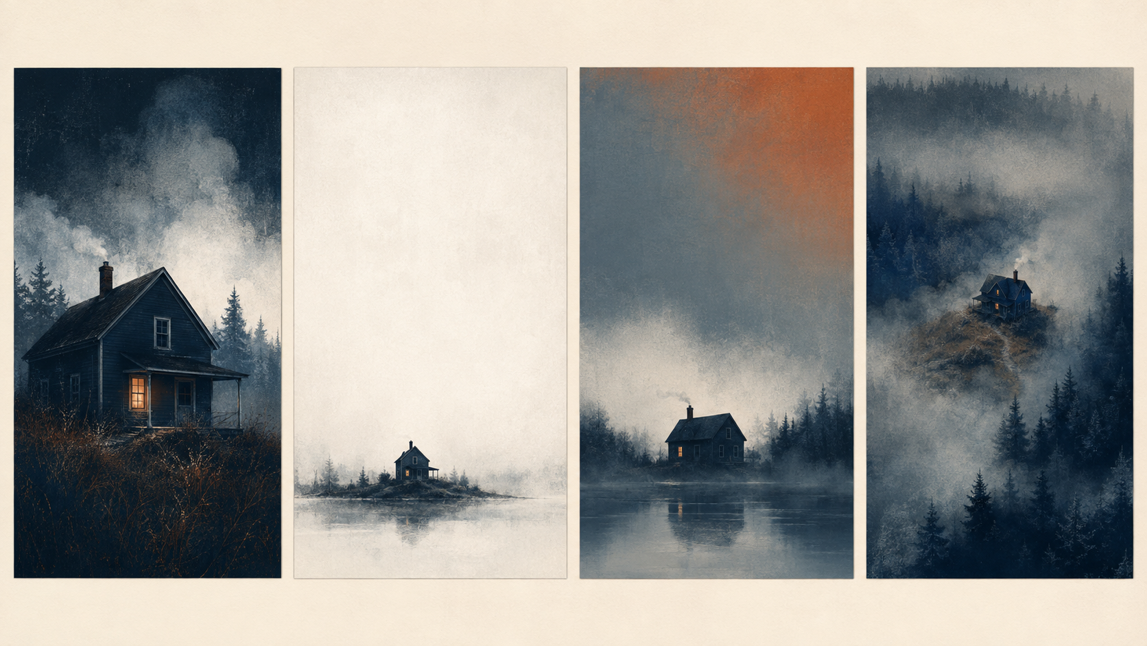
An original illustrative contact sheet for this guide, not a benchmark or a claim about a specific model output. Compare hierarchy and title space before detail.
Review the matrix in this order:
- At small thumbnail size, can you identify the dominant shape and genre family?
- In grayscale, does the focal point still win?
- With a temporary title rectangle overlaid, is the title space genuinely quiet?
- At full size, are hands, faces, architecture, and repeated details coherent enough to repair?
- Against nearby category covers, is the concept legible without becoming a copy?
Discard concepts with broken hierarchy even if their details are beautiful. Repairing a hand is local. Repairing a cover with no focal order usually means starting again.
Five copy-ready AI book cover prompt systems
These are systems, not magic sentences. Replace the bracketed fields with facts from your book. Keep the title out of the generation request and add it during layout.
1. Literary mystery with quiet tension
Deliverable: portrait front-cover key art for an adult literary mystery,
designed to remain clear as a small bookstore thumbnail.
Shelf promise: intelligent, restrained unease; coastal setting; no gore.
Focal metaphor: one weathered red buoy floating upright in an unnaturally still
black inlet, its reflection interrupted by a clean rectangular absence.
Composition: buoy below center, distant horizon in the lower third, broad quiet
mist in the upper half reserved for title typography.
Visual language: tactile editorial painting, simplified shapes, subtle paper grain,
controlled edges, not photorealistic.
Palette: charcoal, cold gray, muted red, one narrow band of pale dawn.
Exclude: people, boats, police tape, blood, readable words, letters, logo, watermark.
The metaphor carries the missing-person tension without giving away plot. If the result becomes generic horror, remove dramatic lightning and deepen the quiet geometry rather than adding more ominous adjectives.
2. Epic fantasy built around scale
Deliverable: vertical fantasy novel front-cover key art, bold at thumbnail size.
Shelf promise: ancient wonder and dangerous ascent, for adult epic fantasy.
Focal metaphor: a tiny cloaked traveler at the base of a colossal ring-shaped
mountain whose inner edge glows like a distant eclipse.
Composition: low viewpoint, traveler in lower center, ring dominates the middle,
uncluttered dark sky across the top quarter for a future title block.
Visual language: grand painterly environment, believable rock scale, atmospheric
depth, crisp silhouette, restrained detail near the title area.
Palette: near-black blue, mineral gray, oxidized gold light.
Exclude: dragons, castles, armies, modern clothing, runes, readable text, logos.
Scale depends on contrast between the small traveler and the ring. If the traveler becomes invisible, request a clearer rim light and a slightly larger silhouette; do not fill the scene with companions.
3. Contemporary romance without stock-photo shorthand
Deliverable: portrait key art for an uplifting contemporary romance.
Shelf promise: witty intimacy, creative partnership, warm urban energy.
Focal metaphor: two differently colored folding chairs angled toward each other
on a rooftop garden, one shared sketchbook resting across the gap.
Composition: chairs occupy the lower two-thirds, diagonal city shadows create
movement, soft uncluttered sky behind the upper title zone.
Visual language: modern graphic illustration, confident shapes, gentle texture,
expressive but not childish.
Palette: coral, deep teal, cream, small accents of leaf green.
Exclude: kissing couple, photographic faces, hearts, wedding symbols, rendered
words, lettering, logos, watermark.
This keeps relationship energy without depending on an unlicensed or inconsistent face. If characters are essential, build an authorized anchor and use the character consistency workflow before requesting multiple scenes.
4. Practical nonfiction with one explanatory object
Deliverable: vertical front-cover key art for a practical nonfiction business book.
Shelf promise: clarity, durable systems, calm competence; not hustle culture.
Focal metaphor: a transparent stack of three interlocking trays, each receiving
one stream of scattered paper fragments and releasing one organized line.
Composition: object centered in the lower-middle, strong silhouette, generous
clean field in the upper 40 percent for title and subtitle.
Visual language: precise editorial 3D illustration, matte materials, soft studio
shadow, simple geometry, no interface screenshot.
Palette: warm white, graphite, muted cobalt, one amber accent.
Exclude: lightbulbs, rockets, handshakes, money, charts, people, words, logos.
Nonfiction covers often need a clearer subtitle than novels. Protect more negative space and test with the real title length early, even though the final type remains outside the generated image.
5. Memoir with restrained personal symbolism
Deliverable: portrait memoir front-cover key art with a quiet editorial tone.
Shelf promise: migration, memory, and reconstruction; intimate but unsentimental.
Focal metaphor: one repaired ceramic bowl seen from above, its repaired seams
forming the simplified outline of two distant coastlines without labels.
Composition: bowl slightly below center on a textured neutral surface, soft shadow,
upper third nearly empty for title, lower edge open for author name.
Visual language: natural still-life photography with subtle material detail,
honest imperfections, no theatrical props.
Palette: chalk white, sand, faded blue, narrow warm metallic seams.
Exclude: passport, airplane, flags, map labels, hands, faces, readable words,
branding, watermark.
Personal symbolism should remain specific to the manuscript. Replace the bowl and coastlines if they do not belong to the author's story. A tasteful image is still wrong when it invents biography.
Revise one block at a time
After the first matrix, name the largest mismatch in a single sentence: “genre reads as horror,” “title zone is too busy,” “the focal object lacks scale,” or “the palette feels juvenile.” Map that mismatch to one prompt block, make one change, and keep the rest fixed.
A revision log can be as simple as:
V1 — centered buoy, painted medium, cold palette: good genre, weak title space.
V2 — same prompt; horizon lowered and mist simplified: title space approved.
V3 — same composition; buoy enlarged 12%: thumbnail silhouette approved.
Next action: stop generating; move selected art to local repair and type layout.
The percentages are creative instructions, not measurements of model compliance. Their value is that they define the intended direction. Save each prompt beside its output so you can return to the last approved state instead of reconstructing it from memory.
Route defects: regenerate, edit, or finish manually
Not every defect deserves a new generation. Use the scope of the problem to choose the tool.
- Regenerate when the shelf promise, focal metaphor, or hierarchy is wrong.
- Edit locally when one face, hand, edge, object, shadow, or patch of clutter is wrong but the composition works.
- Finish manually for title, subtitle, author name, series marks, publisher marks, trim, spine, barcode space, and final color preparation.
When you have a selected concept, the image-to-prompt workflow can help you record its visible structure before an edit. Keep the approved composition in the reference and ask for one bounded repair.
Preserve the existing crop, focal-object scale, lighting direction, palette, and
empty title area. Replace only the malformed lower-left chair leg with one simple,
structurally plausible metal leg matching the other chair. Do not add objects,
people, letters, logos, or decorative texture. Keep every other pixel relationship
as close to the reference as the edit allows.
The clip below is an original motion treatment of this guide's illustrative contact sheet. It demonstrates a review rhythm, not a recorded model session or quality benchmark.
Separate the ebook cover from the print wrap
Once the front concept is approved, create the actual deliverables. For an ebook marketing cover, export to the distributor's current image requirements and inspect the compressed upload. For a paperback, obtain final trim size, page count, paper choice, and bleed setting before building the wrap.
The paperback spine width changes with page count and paper. The back cover needs deliberate copy hierarchy and barcode clearance. Important type and faces need safe margins. These are layout calculations, not aesthetic suggestions for the model.
Keep a production checklist beside the art:
- exact title, subtitle, author, and series text approved;
- licensed fonts and images documented;
- front art extended or rebuilt for the required wrap dimensions;
- spine and back cover aligned to the current template;
- bleed and safe areas checked;
- barcode area left usable;
- color mode and file type match the distributor's current specification;
- proof inspected rather than inferred from the editor preview.
If you publish through more than one service, make a checklist for each. Requirements can differ and can change.
Review the cover at three distances
A technically clean image can still fail as a cover. Review it at three scales.
At thumbnail size, look only for genre, focal hierarchy, and title readability. At normal browsing size, check the relationship between art and type, subtitle clarity, and whether the visual promise feels distinctive. At full size, inspect local anatomy, repeated structures, edges, noise, gradients, and print-sensitive artifacts.
Ask reviewers focused questions. “Do you like it?” produces taste reports. “What genre do you expect?”, “Where did your eye go first?”, and “Which word did you read first?” produce usable evidence. If readers repeatedly predict the wrong category, treat that as a shelf-promise failure even when the image is attractive.
Rights, disclosure, and originality are production checks
Use only references you own, license, or have explicit permission to reuse. Avoid celebrity likenesses, protected characters, publisher logos, and distinctive living-artist imitation. A prompt that says “in the style of” is not necessary to describe medium, edge behavior, palette, or composition.
Keep a source record for references and stock elements. Review the current terms for the image service and the current content or disclosure requirements for every retailer and distributor involved. Policies and contractual rights are not fixed forever, so verify them at publication time.
Originality also matters commercially. Searching a category can show conventions, but the output should not be a close reconstruction of one successful cover. Use category signals to orient the reader, then use your manuscript's own tension, objects, relationships, and palette to create distance.
A compact production checklist
Before approving the key art, confirm that:
- the genre and emotional promise are readable without explanation;
- one focal metaphor dominates at thumbnail size;
- the title and author zones are intentionally quiet;
- generated letters, logos, and accidental watermarks are absent;
- local defects have been routed to edit rather than endless regeneration;
- typography remains editable outside the image;
- ebook and print files are treated as separate deliverables;
- rights, disclosure, and distributor requirements have been checked;
- the final upload or proof has been inspected on the actual destination.
The useful stopping point is not “the model made a beautiful picture.” It is “the concept communicates the right shelf promise, the art can be repaired, and the production layers are under control.”
Frequently asked questions
Should an AI image model render the final book title?
Usually no. Generate key art and intentional title space first. Set the final title, subtitle, and author name in a layout tool where spelling, hierarchy, kerning, and print placement stay editable.
How long should an AI book cover prompt be?
Long enough to define the job. Six concise blocks covering deliverable, promise, metaphor, composition, visual language, and exclusions are easier to debug than a long adjective chain.
Can I use the same image for an ebook and paperback?
You can reuse the approved front key art, but the paperback needs a separate full-wrap layout with back cover, spine, bleed, safe areas, barcode space, and final page-count-dependent dimensions.
What should I do when a promising cover has one bad detail?
Preserve the approved composition and use a targeted edit for the local defect. Regenerate only when the core metaphor or hierarchy is wrong.
How many cover concepts should I generate?
Begin with a six-concept matrix: three metaphors by two compositions. Review it at thumbnail size, select the strongest direction, and make controlled revisions rather than expanding the batch indefinitely.
Can I publish an AI-generated cover without checking rights?
No. Confirm rights to every reference and output, avoid unauthorized likenesses and protected assets, and check the current rules of the generation service, retailer, and distributor before publication.
Turn the workflow into your next cover
Return to the Lem Gen homepage when you want more prompt patterns, or open the GPT Image 2 Workspace for text-to-image to build your first controlled concept matrix. When one concept is almost right, move it to the image-editing Workspace, repair the smallest failing region, and finish the typography in your layout tool.